The story behind the iconic Rolling Stones logo
When designer John Pasche started sketching a small tongue and lips in April 1970, he thought the design might be used for the band's letterhead, or to be printed on their next 45 rpm single.
Little did he know then that it would eventually become the most famous logo in the history of rock 'n' roll.
Over the next 50 years, his sketch was copied, redrawn and reinvented countless times, printed on t-shirts, lighters, mugs, caps and much more.
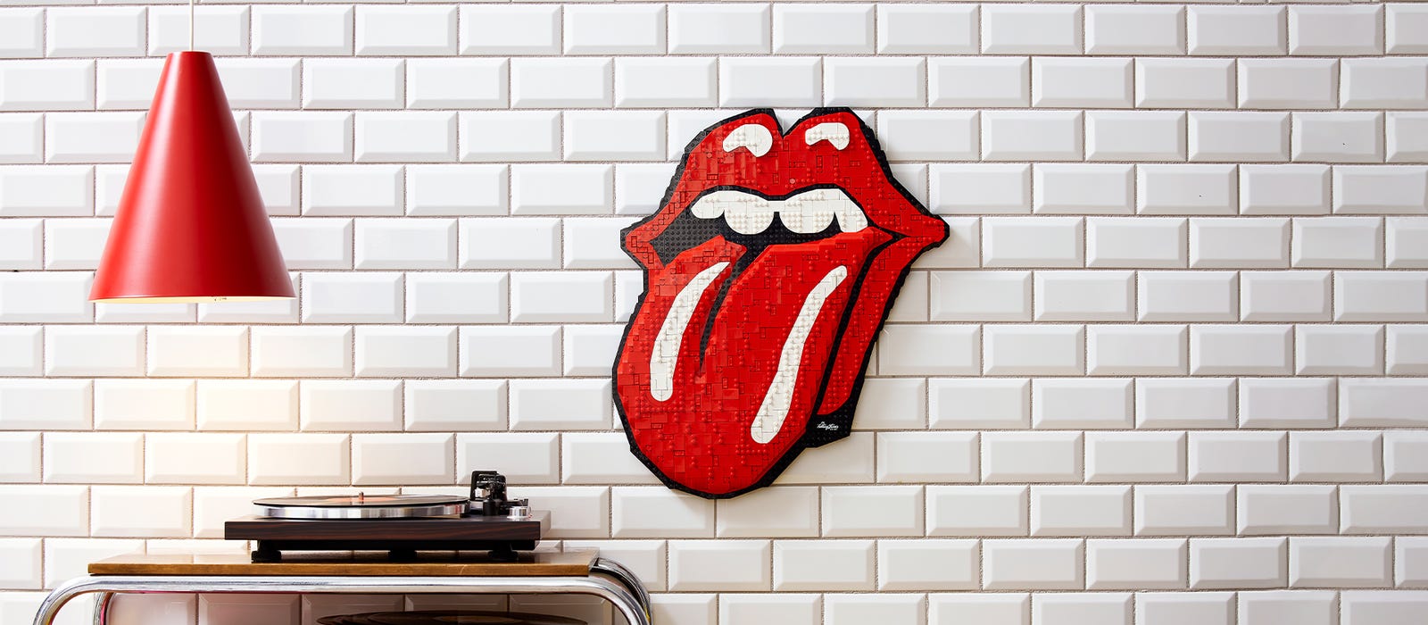
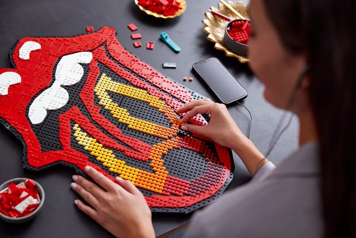
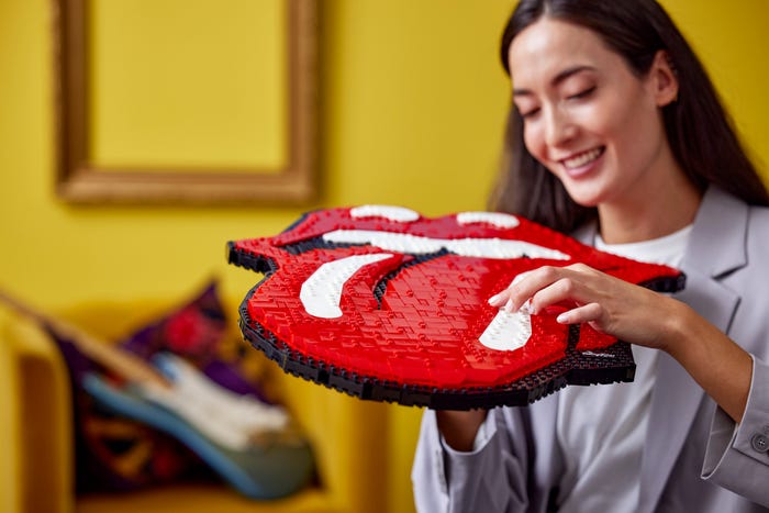
To celebrate the legacy of the Rolling Stones, we've released a brand new LEGO® Art set of the iconic logo, letting fans relive their favorite memories of this illustrious band.
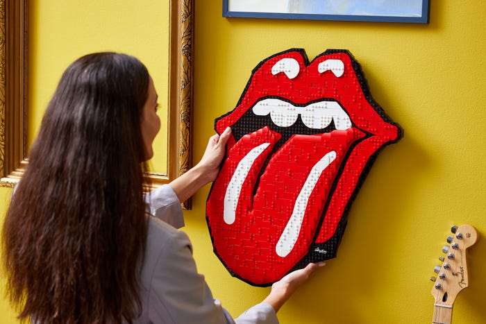
Once built, you can hang the new LEGO Art set on a wall as a tribute to one of the greatest rock bands of all time... and to a logo that has effortlessly stood the test of time so far...
The story behind the iconic Rolling Stones logo
When designer John Pasche started sketching a small tongue and lips in April 1970, he thought the design might be used for the band's letterhead, or to be printed on their next 45 rpm single. Little did he know then that it would eventually become the most famous logo in the history of rock 'n' roll. Over the next 50 years, his sketch was copied, redrawn and reinvented countless times, printed on t-shirts, lighters, mugs, caps and much more. To celebrate the legacy of the Rolling Stones, we've released a brand new LEGO® Art set of the iconic logo, letting fans relive their favorite memories of this illustrious band. Once built, you can hang the new LEGO Art set on a wall as a tribute to one of the greatest rock bands of all time... and to a logo that has effortlessly stood the test of time so far... A logo that never goes away bored You could argue that the Rolling Stones logo is even more recognizable than the band itself, that it transcends the musical icons it represents and that it has itself become famous as a symbol of a new era of music, culture, fashion, art and pop culture that rebels against the established order. Even today, the power that the Rolling Stones' tongue-and-lips logo radiates is known to both old and young generations, who immediately recognize the logo and the meaning behind it.
The logo was first seen publicly when the classic album 'Sticky Fingers' was released in April 1971, and was immediately inextricably linked to the band. It was depicted on the back, on the label and, even more strikingly, on the slip sleeve. From then on, it has remained an iconic symbol of the band. “Well, that's actually how it came about. I thought it just worked for the band,” says logo designer John Pasche. “It's reminiscent of the way children stick out their tongues at people. It represents a certain attitude, and that just suited the band. It was just for them, it just felt right when I designed it. It has a real 70's vibe. It is a bit seductive, but also quite soft and feminine. It's a kind of gentle protest.” Since then, the logo has appeared on every Rolling Stones album, and over the years unique versions have been created for special releases and performances. It is representative of the band's style, scenography and merchandise. “It symbolizes the lead singer, but also the entire band, and it can be adapted endlessly. We get to see that once again with the new version designed for the band's SIXTY tour. That one is absolutely brilliant – it just looks fantastic. It looks historic and traditional, but brand new at the same time,” says John. And now it has also been made into a LEGO® Art set, which fans of the Rolling Stones can give a place of honor at home. The set celebrates the band's sixtieth anniversary and embodies the soul of rock 'n' roll and creative resistance. Inspiration for an icon Where does the idea of hot lips come from? When John was a young art student, the band showed him an image of the Hindu goddess Kali – often depicted with her tongue sticking out – as inspiration for coming up with the Rolling Stones logo. He opted for a striking, stylish and somewhat provocative design, but also drew inspiration for his version from other corners of pop culture. “I was especially inspired by the pop art exhibitions I visited, including those by [Andy] Warhol and [Roy] Lichtenstein. I was captivated by their boldness and interest in merchandise rather than regular still lifes or paintings. I was enormously influenced by that brutal art, which, as it were, gives you a buzz when you look at it.”
What does the Rolling Stones logo actually mean?
The red tongue and lips represent free expression, the raw essence of rock 'n' roll, empowerment – and of course, the immortal legacy of the Rolling Stones. And what better way can fans pay tribute to this icon than by building the LEGO® Art Rolling Stones set? “Who would have believed fifty years ago that this design would ever be made into a LEGO set... They really did a great job,” John continues. This was of course music to the ears of our LEGO designers – Fiorella Groves and Annemette Baaskjær Nielsen – who have done everything they can to make the new LEGO Art Rolling Stones set as accurate as possible and to honor the original image by John Pasche. to do what she deserves. Now you just have to find the perfect spot to create your own piece of rock 'n' roll art history. Want some more Rolling Stones? Listen to the full soundtrack here.